This follows on from a previous post, where I used a Rectangular Rig to Graph a Function. If you looked carefully you may have noticed how useless I am at formulas in Revit. I mention this because you may find it encouraging. If my work is the result of trial and error then maybe there is hope for you. Something like that.
American History & Practical Maths
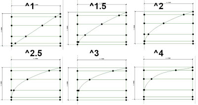
In my first attempts at a quadratic graph, I was too lazy to look up the symbol to use for "to the power of" and I just used Y1*Y1 for squared. Later on I changed it to Y1^2 because I was getting embarassed about being so lame. The good part of this was that it started me thinking about other powers and I realised that I could replace the 2 with a parameter.

Now you make one family and you can vary the curve increasing the "power of Y" or the "power of X" depending on which way up you make the graph. Of course, if the power is 1 you will have a straight line (X=Y) If it was less than one you would get a concave form.
Use this curve in a massing family (or Generic Model Adaptive) to create a revolve. Looks like a coconut macaroon.

Now lay a whole bunch of them out and vary the parameters in a systematic manner. I've taken care to organise the parameters so just 3 of them display to the end user. Here we are keeping the base width constant and varying the other 2: power & height.

Of course you can generate much more variety by manipulating all three and taking them to extremes.

Here's a view that shows what we are doing more clearly. I was quite excited by this, but if you look closely the curves are not quite smooth. There is a certain amount of "necking" taking place at extreme values. Unwanted bulges.

Seemed to me this was a result of not having enough points to hold the curve steady. So I set about making a more finely divided rig, which gives me a chance to talk you through the process.
Two points created in an elevation view. Labelled dimension gives me a height parameter. Spline thru points joins them with a ref line. Set the work plane to the vertical plane of each point in turn. Place points on points, give them offset values. Label these with a width parameter. Complete the rectangle. This is a classic rectangular rig. See also the video on my Vasari Talk session.

I'm creating vertical rungs using Normalised Curve Parameter positions that are assigned parameters (x1, x2, x3 etc) Initially these create 10 equal divisions (0.1, 0.2, 0.3 etc)

Then I string a spline across these rungs. These points get parameters too (y1, y2, y3 etc) Now you can linke X & Y with a simple formula to generate a regular curve. That's what I did before with 5 divisions. Now I have a finer degree of control.

Power of 2 gives us a nice smooth parabola.

Power of 6 concentrates most of the curve in the "middle". You get a relatively straight section, then a sharp bend, then an almost flat top. This is where the anomalies start to show up. At power of 9 the curve starts to reverse because there aren't enough points to hold its line. (see how it flares out slightly at the base)

I dealt with this by making the points closer together near the ends. It's kind of like using a logarithmic scale on your graph.

All good, but what if I want the curve to go beyond the vertical. This is what I did previously with the Gherkin (see the link at the beginning of this post) It's a bit of a hack, but it works.

So I set this up and created a much bigger array.

The results are quite interesting:

a wide range of forms ranging from Gherkin-like shapes to onion domes,

all from the same family and just by adding a 4th parameter called "Waist Height"

American History & Practical Maths
In my first attempts at a quadratic graph, I was too lazy to look up the symbol to use for "to the power of" and I just used Y1*Y1 for squared. Later on I changed it to Y1^2 because I was getting embarassed about being so lame. The good part of this was that it started me thinking about other powers and I realised that I could replace the 2 with a parameter.

Now you make one family and you can vary the curve increasing the "power of Y" or the "power of X" depending on which way up you make the graph. Of course, if the power is 1 you will have a straight line (X=Y) If it was less than one you would get a concave form.

Use this curve in a massing family (or Generic Model Adaptive) to create a revolve. Looks like a coconut macaroon.
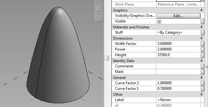
Now lay a whole bunch of them out and vary the parameters in a systematic manner. I've taken care to organise the parameters so just 3 of them display to the end user. Here we are keeping the base width constant and varying the other 2: power & height.

Of course you can generate much more variety by manipulating all three and taking them to extremes.

Here's a view that shows what we are doing more clearly. I was quite excited by this, but if you look closely the curves are not quite smooth. There is a certain amount of "necking" taking place at extreme values. Unwanted bulges.

Seemed to me this was a result of not having enough points to hold the curve steady. So I set about making a more finely divided rig, which gives me a chance to talk you through the process.
Two points created in an elevation view. Labelled dimension gives me a height parameter. Spline thru points joins them with a ref line. Set the work plane to the vertical plane of each point in turn. Place points on points, give them offset values. Label these with a width parameter. Complete the rectangle. This is a classic rectangular rig. See also the video on my Vasari Talk session.

I'm creating vertical rungs using Normalised Curve Parameter positions that are assigned parameters (x1, x2, x3 etc) Initially these create 10 equal divisions (0.1, 0.2, 0.3 etc)

Then I string a spline across these rungs. These points get parameters too (y1, y2, y3 etc) Now you can linke X & Y with a simple formula to generate a regular curve. That's what I did before with 5 divisions. Now I have a finer degree of control.

Power of 2 gives us a nice smooth parabola.

Power of 6 concentrates most of the curve in the "middle". You get a relatively straight section, then a sharp bend, then an almost flat top. This is where the anomalies start to show up. At power of 9 the curve starts to reverse because there aren't enough points to hold its line. (see how it flares out slightly at the base)

I dealt with this by making the points closer together near the ends. It's kind of like using a logarithmic scale on your graph.

All good, but what if I want the curve to go beyond the vertical. This is what I did previously with the Gherkin (see the link at the beginning of this post) It's a bit of a hack, but it works.

So I set this up and created a much bigger array.

The results are quite interesting:

a wide range of forms ranging from Gherkin-like shapes to onion domes,

all from the same family and just by adding a 4th parameter called "Waist Height"

Want to take a look ? Click on the link
fantastic!!!
ReplyDelete